
Digital projects · 2 November 2026
ITS DEMOS Academy: the new website by Annoluce, bringing together guidance, artificial intelligence and digital services
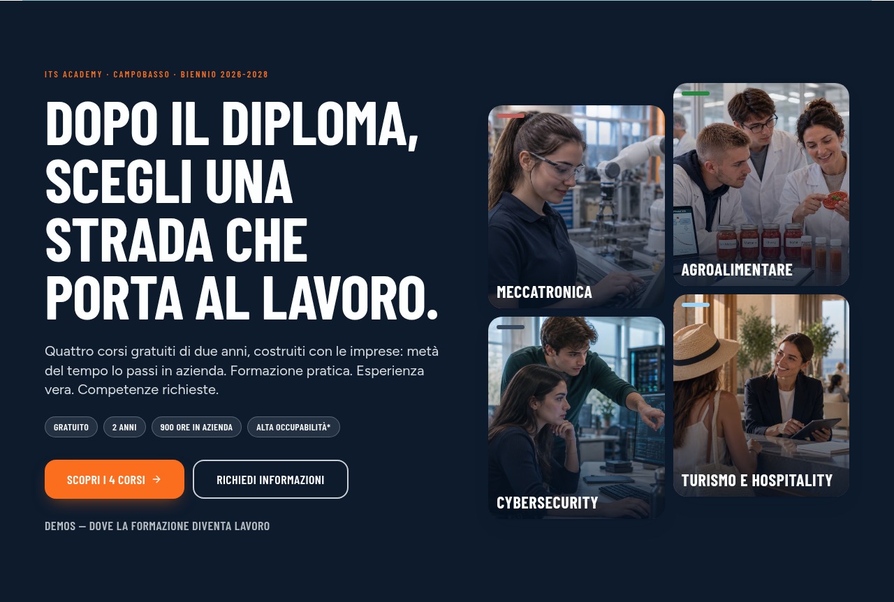
More than a visual refresh. With itsdemos.it, the Molise ITS Academy’s online presence guides students and families from discovering courses to requesting information and applying for admission.
How do you tell the story of a school preparing people for the professions of the future? Publishing a list of courses is not enough. People need help understanding the opportunities, recognising themselves in a pathway and finding answers to their questions.
This is the need behind the new ITS DEMOS Academy website, created by Annoluce: a project integrating communication, guidance and digital services while preserving the Foundation’s institutional identity.
The result is itsdemos.it, a website designed not just to be visited, but to be used.
People first, programmes second
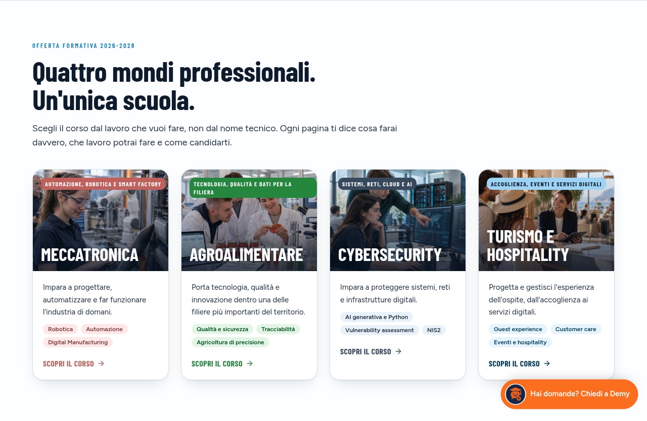
The first innovation is how the courses are presented. The starting point is not official terminology, but the question asked by someone choosing their future: what will I learn, and where could it take me?
Mechatronics, agri-food, cybersecurity and tourism have dedicated pages connecting practical activities, skills and potential career opportunities. Official course names and information remain available within a clearer narrative.
The communication highlights what makes ITS education distinctive: connections with businesses, hands-on learning and time spent in companies. Numbers and information become useful tools for choosing, rather than details buried in a document.
Four pathways, four visual identities
The new website has a recognisable identity, with bold typography and colours distinguishing the study areas.
Each course retains its personality while belonging to the same visual system. This helps visitors navigate and distinguish the options more immediately.
Pages alternate images, concise content and deeper explanations. Visitors seeking an overview can quickly find the essentials; those wanting more detail can explore skills, course arrangements, contacts and frequently asked questions.
From an advertisement to the right page
Course pages also serve as destinations for communication campaigns. Visitors arriving from an advertisement are not left with a generic introduction to the school: they immediately find the pathway that interested them.
Information requests are available near the beginning of the page and again after the detailed content. The goal is to shorten the distance between interest and contact without forcing everyone to read in the same way.
The page becomes the advertisement’s second chapter: expanding on its initial promise and offering a concrete next step.
Demy: artificial intelligence supporting guidance
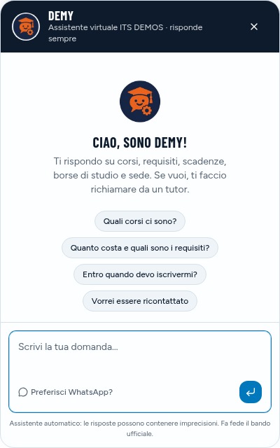
New features include Demy, the website’s virtual assistant.
Students and families can ask natural-language questions about courses, requirements, deadlines, scholarships and other available information. The assistant draws on knowledge built from the website’s content, allowing updates to reach the conversational service too.
Demy does not replace the administrative office: it offers an initial source of guidance and can help visitors request a callback. This is a practical use of artificial intelligence within people’s journey, rather than a novelty added for its own sake.
A quiz to explore your choice
The website also offers the “ITS or University?” quiz: twelve questions returning an indicative profile and suggestions for pathways to explore.
It is not a verdict on a student’s future, but a tool for reflecting on preferences and learning styles. From the result, visitors can explore courses or request a conversation with the Foundation.
Guidance moves from reading alone to a participatory experience.
Digital applications and tools for the administrative office
When admissions are open, enabled courses allow applicants to complete their application online and upload the required documents.
Closure follows the configured deadline: application links are hidden and submissions after the deadline are blocked. Information requests remain available, including for those interested in future opportunities.
The project also includes a restricted area where authorised staff can view and filter applications, download attachments and update their status. The new experience therefore supports both the public and those managing admissions.
A living website with accessible news and documents
Alongside course presentations is an ecosystem of content: a blog, podcasts, notices, scholarships and institutional sections.
The project preserves 126 articles from the previous website, retaining their addresses, and introduces new editorial content. Colourful sketch covers give insights a recognisable visual identity without replacing the original photographs in the archive.
Calls for applications, attachments, extensions and rankings have dedicated pages. The transparency and PNRR sections keep institutional information and documents accessible.
Highlighted notices quickly bring important announcements to the public’s attention.
Attention to smartphones, privacy and contact quality
Mobile browsing is part of the project: dedicated menus, adaptable content and easy-to-reach contacts support visitors on the move.
Privacy and cookie pages include a system for expressing and changing analytics-cookie preferences. In forms, the privacy notice opens in a new tab to avoid interrupting completion.
Information requests also include an anti-bot check before saving and notifications, without a visible captcha.
Measure and share, not just publish
The website measures meaningful interactions, such as information requests, quiz use and chat openings. This helps observe how its tools are used and provides a basis for improving communication over time.
Dedicated titles and descriptions, structured data, a sitemap and sharing images complete the work on content discoverability and social presentation.
These are not automatic promises of results: they are tools for building a more informed, measurable digital presence.
Modern means useful
For Annoluce, modernising a website means more than changing its appearance or adding new technologies.
It means combining identity, content and services, giving each element a precise purpose. On itsdemos.it, design helps visitors navigate, pages explain opportunities, the quiz encourages reflection, the assistant makes information easier to find and digital tools support applications.
An online presence that tells the story of ITS DEMOS Academy and, above all, helps people connect with the Foundation.